Optimize Your Website for Mobile-First Users
05/20/2025
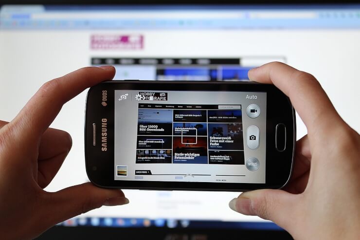
In today’s digital world, mobile-first is not just a trend but a standard. With over half of web traffic coming from mobile devices, your website must be built with mobile users as the primary focus. A site that loads slowly or appears broken on a phone can cost you visitors, leads, and credibility. Here’s how to make sure your website is ready.
Design With Mobile as the Starting Point
The mobile-first design begins at the wireframe stage. Instead of shrinking a desktop site down to fit a phone, start with the mobile experience and scale up. Prioritize a clean layout, readable text, and tap-friendly buttons. This ensures the essentials are always visible and functional, especially important for solopreneurs and small businesses trying to capture attention fast.
Use Responsive Design and Flexible Grids
Responsive design is non-negotiable. Using CSS frameworks like Bootstrap or Tailwind, or relying on a responsive theme, helps your website automatically adjust to different screen sizes. This keeps your layout consistent whether someone’s on a smartphone, tablet, or desktop, eliminating the need for multiple site versions and simplifying management.
Improve Mobile Page Speed
Speed is crucial on mobile. Compress images, limit the use of large scripts, and enable lazy loading for media. Tools like Google PageSpeed Insights can help you identify and fix bottlenecks. A one-second delay in load time can significantly reduce conversions, so optimizing speed is essential.
Simplify Navigation for Smaller Screens
Mobile users don’t have patience for complex menus. Use a hamburger menu or sticky bottom navigation for easy access to important pages. Keep your menu items concise, and make sure users can tap each link without zooming or struggling. Smooth navigation equals longer visits and lower bounce rates.
Optimize Forms for Touch Input
If your site uses forms, whether for contact, sign-up, or checkout, ensure they are mobile-friendly. Use larger input fields, auto-fill options, and limit the number of required fields. Keep everything vertically stacked and spaced for easy thumb access. A frustrating form is a surefire way to lose a potential lead.
Test Across Multiple Devices and Browsers
Even a well-designed mobile site can behave unpredictably on different devices. Use tools like BrowserStack or responsive design mode in your browser to test how your site looks and functions on iPhones, Android phones, and various screen sizes. This lets you catch layout issues before your users do.
Prioritize Mobile SEO Best Practices
Google uses mobile-first indexing, meaning it evaluates the mobile version of your site first. Make sure your mobile site contains the same content as your desktop version. Use structured data, compress code, and ensure internal links are easily accessible. Mobile SEO affects your visibility just as much as desktop SEO, if not more.
Dataczar Connect is an all-in-one marketing solution allowing you to build a beautiful website with ease, create campaigns in a few clicks, and make branded marketing materials in a matter of minutes. There’s no coding or hidden costs. In just 5 easy steps, you’ll have your own domain for your business or brand and begin connecting with prospects through omnichannel marketing and content creation.